
Balancing Soft Blue and Concentrated Red in Turquoise and Ruby Jewelry
Balancing Soft Blue and Concentrated Red in Turquoise and Ruby Jewelry
Turquoise has a soft, matte presence. Its surface may be even and robin’s-egg blue, or marked with brown or gray matrix that makes it look more like stone found in the ground than a polished jewel. Ruby is usually more insistent. It can be deep wine, vivid red, or slightly purplish, and its appeal often comes from the way light gathers inside it rather than simply resting on the surface. Put them together and the contrast can feel Southwestern, old-world, playful, or surprisingly restrained depending on the proportions and the metal.
The metal makes a large difference. Turquoise and ruby in yellow gold can look warm and almost painterly, particularly when the turquoise is a blue-green shade and the ruby leans toward raspberry. In silver, the same combination has more edge. Oxidized silver can settle the color down, keeping a turquoise-and-ruby ring from looking too bright or decorative. Rose gold pushes the red forward and can make the turquoise seem cooler by comparison. White metal creates the sharpest contrast, though it can also make the combination feel more formal than most people expect.
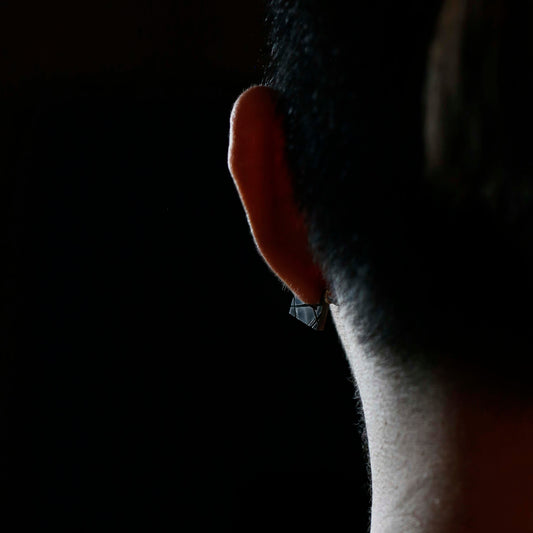
The most wearable pieces tend not to divide the two stones into equal, highly polished blocks of color. A small ruby set beside an irregular turquoise cabochon often feels more natural than a perfectly symmetrical arrangement. The ruby supplies a glint, while the turquoise gives the eye a broader area to rest on. In earrings, that balance matters even more. A turquoise stud with a tiny ruby accent can look composed when the wearer is standing still, then flicker with color as she turns her head. Larger turquoise drops may be beautiful but can become noticeable in a practical way by the end of a long day, especially if they pull on a thin ear wire.
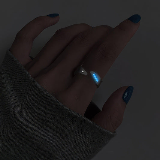
A ring brings out the differences in material character. Turquoise is commonly shaped as a cabochon, with a rounded, polished surface rather than facets. It catches a broad wash of light across the dome. Ruby, even in a small size, can be faceted and bright. On a hand, the contrast appears in ordinary gestures: turquoise shows its color when someone reaches for a cup, while the ruby flashes at the edge of a knuckle. That combination has a little movement built into it.
It also asks for different kinds of care. Turquoise is relatively soft and porous compared with ruby, and it can absorb oils, lotions, and other substances that gradually alter its appearance. A turquoise ring worn every day may develop a darker, more handled look, particularly around the edges or where it meets the setting. Some people like that change. It gives the stone the evidence of a life. Others would rather reserve turquoise for earrings or pendants, where it is less likely to meet countertops, keys, and the hard corners of daily work.
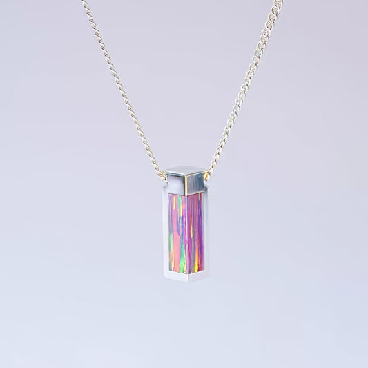
Ruby is tougher, though the setting still matters. A high, exposed stone can catch on clothing or take a direct knock, while a bezel or a lower setting tends to feel easier to live with. The quality of a piece often reveals itself in these less glamorous details. A bracelet should not twist constantly so the stones disappear beneath the wrist. A clasp should close with a definite click. On a necklace, a pendant should settle near the collarbone rather than repeatedly flip over, especially if the turquoise has a visible matrix that is part of its character.
The color pairing carries associations, but it does not have to announce them. Turquoise has long been connected with protection, place, and personal adornment across different cultures, while ruby has accumulated its own history of passion, status, and significance. Those meanings can be present without turning a piece into a symbol with one fixed interpretation. A turquoise-and-ruby ring passed down in a family may feel specific to the person wearing it, shaped by an anniversary, a trip, a familiar piece of clothing, or simply the fact that it was the ring chosen again and again.
I have noticed that this combination works best when the wearer does not over-coordinate it. A turquoise pendant can sit with a thin gold chain and a plain signet ring. Small ruby studs can stay in while the rest of the jewelry changes. The colors already have enough conversation between them. Adding too many similarly bright stones can make the outfit look arranged rather than lived in.
There is something appealing about their disagreement. Turquoise has the look of weather, dust, and open sky. Ruby brings a denser, more polished red, the color of something held close. Together they can be vivid without being flashy, particularly when the stones are allowed to keep their unevenness: a little matrix, a slightly imperfect shape, a ruby that is not perfectly uniform. Those details are often what make the piece remain interesting after the first impression has worn off.