
Red and Blue Jewelry Looks Change with Light, Metal, and Setting
Red and Blue Jewelry Looks Change with Light, Metal, and Setting
The pairing can be crisp and graphic, especially in enamel or polished stones. A red enamel drop against a blue enamel stud has the clean visual quality of painted glass. With gemstones, the effect is less fixed. Garnet beside sapphire looks deep and grown-up, almost wine-colored and midnight-toned, while turquoise with red coral feels much more direct and sunlit. Lapis lazuli brings a soft, matte blue that changes the character of red entirely. Next to a glossy ruby-colored stone, it can make the red look brighter and the blue less formal.
Metal changes the conversation. Yellow gold warms both colors and can push a red-and-blue piece toward the feeling of old jewelry, even when the design is quite modern. Silver and white gold sharpen the contrast, making the colors look cooler and more graphic. Rose gold can be surprisingly good with blue, but it tends to soften red rather than intensify it. The finish matters as much as the metal. High polish gives the pairing a formal, almost lacquered appearance. Brushed or lightly textured metal lets the colors feel less arranged and easier to wear with denim, knitwear, or other everyday pieces.
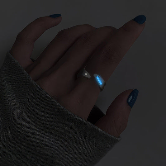
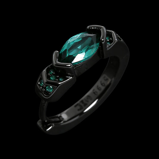
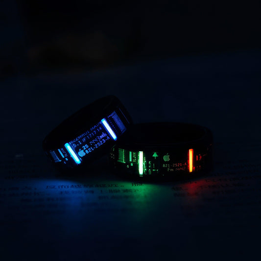
I notice this most in rings. A red-and-blue ring does not stay still long enough to be viewed like a pendant in a display case. It flashes while someone turns a key, holds a phone, or reaches across a table. A low setting keeps the color close to the hand and avoids the feeling of wearing a miniature ornament. A taller setting catches more light, but it can snag on pockets and sweater cuffs, and the stone becomes something the wearer has to think about. For daily use, the quality of the setting often matters more than the size of either stone. Prongs should feel even and secure, and the underside should not have rough edges that collect lotion or catch on fabric.
Earrings handle the colors with more freedom. Small red studs paired with blue drops can look natural because the eye reads them as part of movement rather than as a matched object. With hoops or articulated earrings, blue stones can swing below a red accent and pick up changing light as the wearer walks. That motion keeps the colors from becoming too literal. A perfectly symmetrical red-and-blue pair may recall a uniform, a holiday decoration, or a particular national palette. Slight variation in size, shape, or placement makes the combination feel more personal.
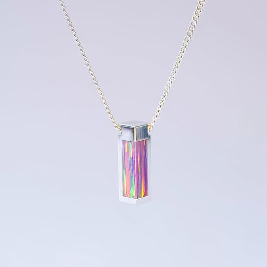
Necklaces are less forgiving. Color sitting near the collarbone is visible for longer, especially against a white shirt or an open neckline. A strand with alternating red and blue beads can be beautiful, but it needs some irregularity in scale or surface to avoid looking overly arranged. Smooth beads line up in a way that can feel formal. Faceted stones break the line with little flashes of light. A blue pendant with a small red accent often wears more quietly than a piece divided evenly between both colors. The blue becomes the ground, and the red reads as a point of emphasis rather than a competing field.
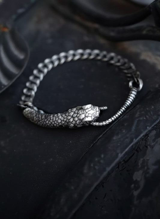
Material character also keeps this color pairing from becoming too neat. Natural turquoise can have dark matrix lines and variations that make it look less like a flat blue than a sky seen through branches. Coral may be warm orange-red rather than true crimson, and dyed materials can fade or rub at the edges with regular wear. Enamel can chip if it hits a hard surface, while softer stones may show scratches long before the wearer notices them. Sapphires and rubies are better suited to rings that stay on through daily activity, though even durable stones depend on a sound setting and sensible care. A bracelet receives more punishment than a necklace. Its underside rests against desks, counters, and sleeves, and the clasp is tested every time it is taken off one-handed.
There is also a social quality to red and blue that is difficult to avoid. Together, the colors can suggest school colors, team colors, flags, holidays, or a childhood memory of a particular piece of costume jewelry. That is not necessarily a problem. Jewelry often carries associations that were never part of its original design. A person may choose a red-and-blue pendant because it recalls a parent’s brooch, a stone bought on a trip, or simply the colors worn at an important time in life. The meaning may be obvious to the wearer and invisible to everyone else, which is often how personal jewelry works best.
As a gift, the pairing can be easier to misread than a single-color piece. Red is sometimes offered as romance, blue as calm or loyalty, but those tidy meanings do not account for how people actually wear jewelry. A dark red garnet might appeal to someone who avoids bright color. A small blue stone with a red thread of enamel may suit a person whose wardrobe is mostly black, cream, and denim. The useful question is less what the colors are supposed to symbolize than whether they resemble the recipient’s existing habits. Someone who wears a plain gold band may prefer a small colored accent. Someone already comfortable with mixed metals and stacked rings might enjoy the tension of two strong stones sitting together.
Red and blue jewelry stays interesting when the contrast is allowed to remain a little unresolved. The red does not have to be softened into burgundy, and the blue does not have to be pale enough to disappear. What matters is how the colors meet the material, the metal, and the body. A blue stone partly hidden beneath a sleeve can seem calm until a red detail catches the light beside it. A pair of earrings may look almost restrained from across a room, then become vivid when the wearer turns their head. Those changes are what keep the combination in rotation. It does not give the same impression every time it moves.